
A Journey Through Time

Medium: I have used 300 gsm paper to create the initial sketches and outlined them with a 0.5-micron pen. Five-millimeter sunboard was used to create the initial structure for the frames, which were then molded atop using soft air-dry clay. The sketches have been colored with soft pastels, and the frames with acrylic paints.
The Lawrence School Sanawar founded by Sir Henry Lawrence and his wife Honoria in the year 1847 is widely believed to be the oldest co-ed boarding school in the world and the earliest institute to receive the king's colours under the empire. A student from class 5 - 10, I've had the honour of experiencing the history and the beauty of this hilltop firsthand.
In this series of 3 frames, I have depicted the English influenced architecture and the changing context and purpose of the institute with the passage of time. The melting frames depict the inevitable passage of time and the change that it brings about.
The Adolescent Mind
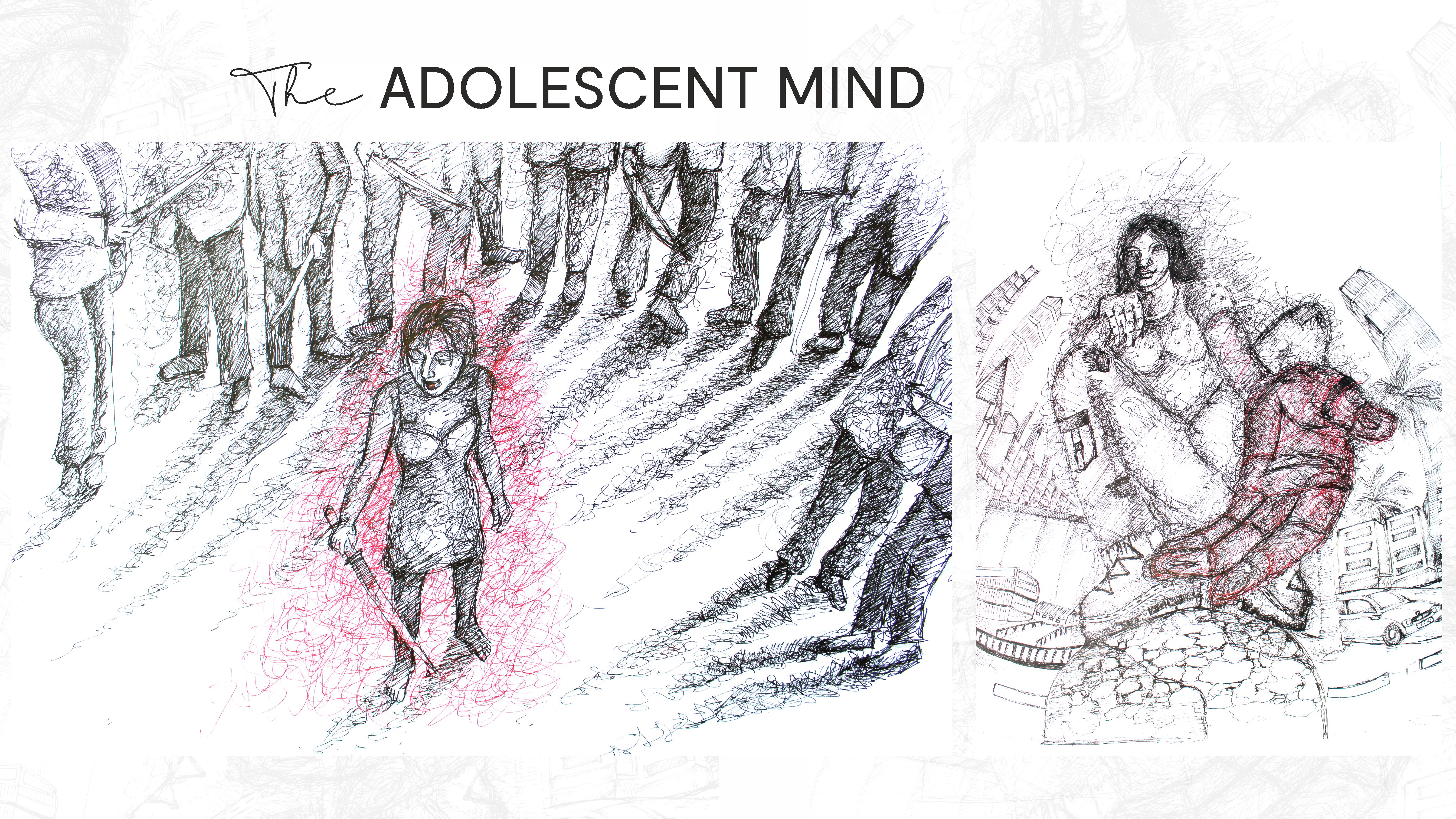
Medium: I made these two sketches with a 0.8, 0.5 and 0.3 micron pen on ivory paper each depicting the themes mentioned above and used scribbles as symbolic of the confusion and challenges that teenage brings about.
I've always found human behaviour and the mind, as well as the phenomena that guide our various thought processes and actions, to be incredibly fascinating. These two scribble sketches portray two common teenage fallacies that I've studied this academic year in psychology: imaginary audience and the urge to indulge in delinquent behaviour respectively. The first sketch represents the mental state of an individual suffering from an extreme case of imaginary audience The subject here believes that everyone is quite literally out to get them and the sword and red colour symbolise aggressive defence mechanisms employed to fight these imaginary enemies.
The second sketch depicts the temptation to indulge in risk taking or delinquent behaviour, which are both common among teenagers. The sketch below depicts the scenario of peer pressure and how it may enable one to take risks without much regard for the consequences that are bound to follow.
Observation Sketches
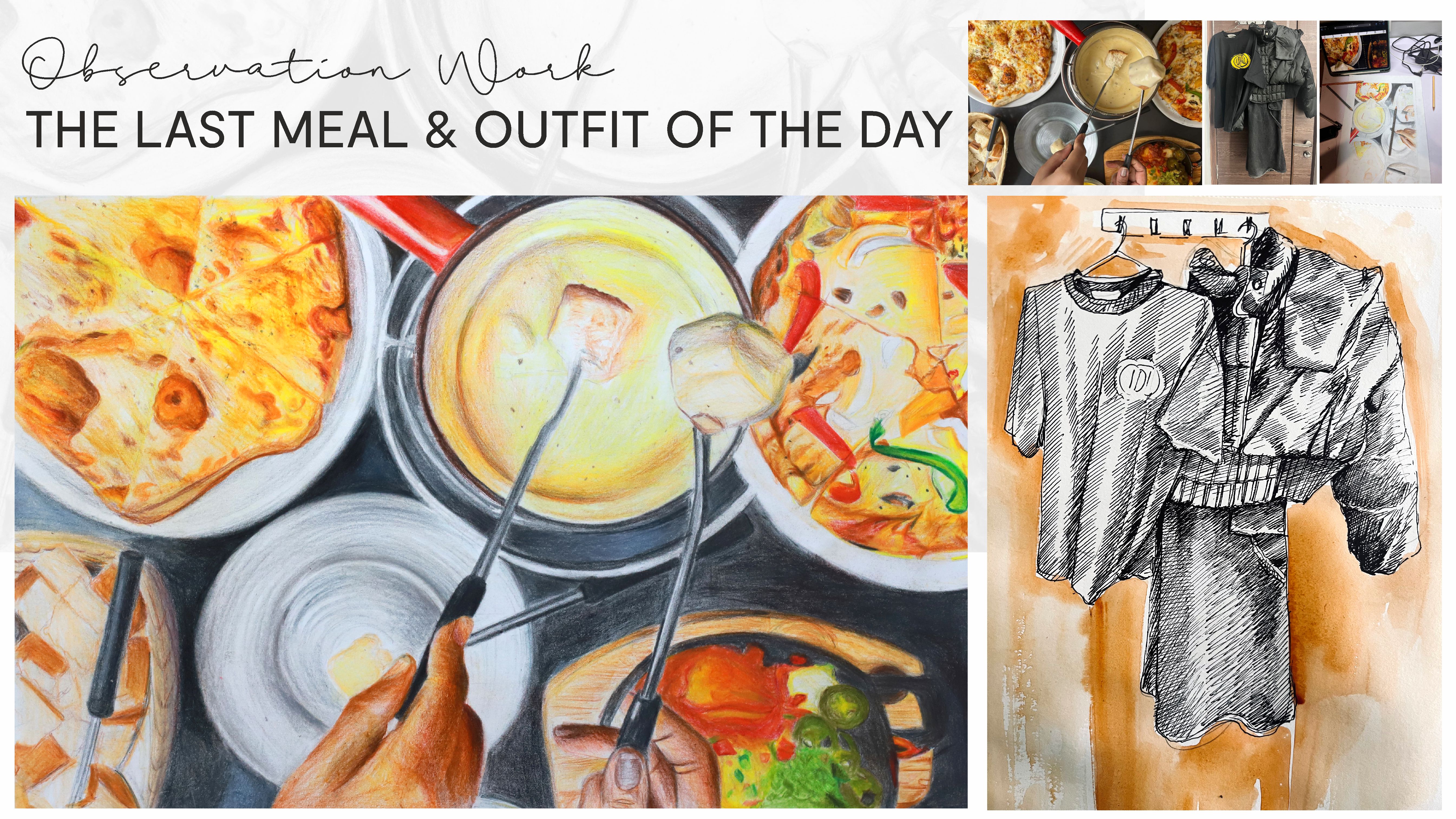
Medium: 1) Ivory Paper (a3) , Watercolour, Watercolour Pencils 2) Watercolour Paper, Micron Pens, Watercolour
This is a pencil colour and watercolour sketch done on an A3 Ivory sheet of the last meal my family, friends and I had before departing from Switzerland last year. While the food was delicious, it was each other's company that we relished even more! I wanted this sketch to capture the warmth of the memories we created during this trip and hence, I have saturated the colour palette in my artwork.
The next artwork is done in watercolour on A3 watercolour paper and depicts the outfit I had picked out to attend the concerts of one of my favorite artists. The initial sketch is done in 0.5 and 0.8 micron and the grayscale of the sketch helps bring out the warm tones of the wooden door behind which has been given a watercolour wash.
Mosaic of Movements
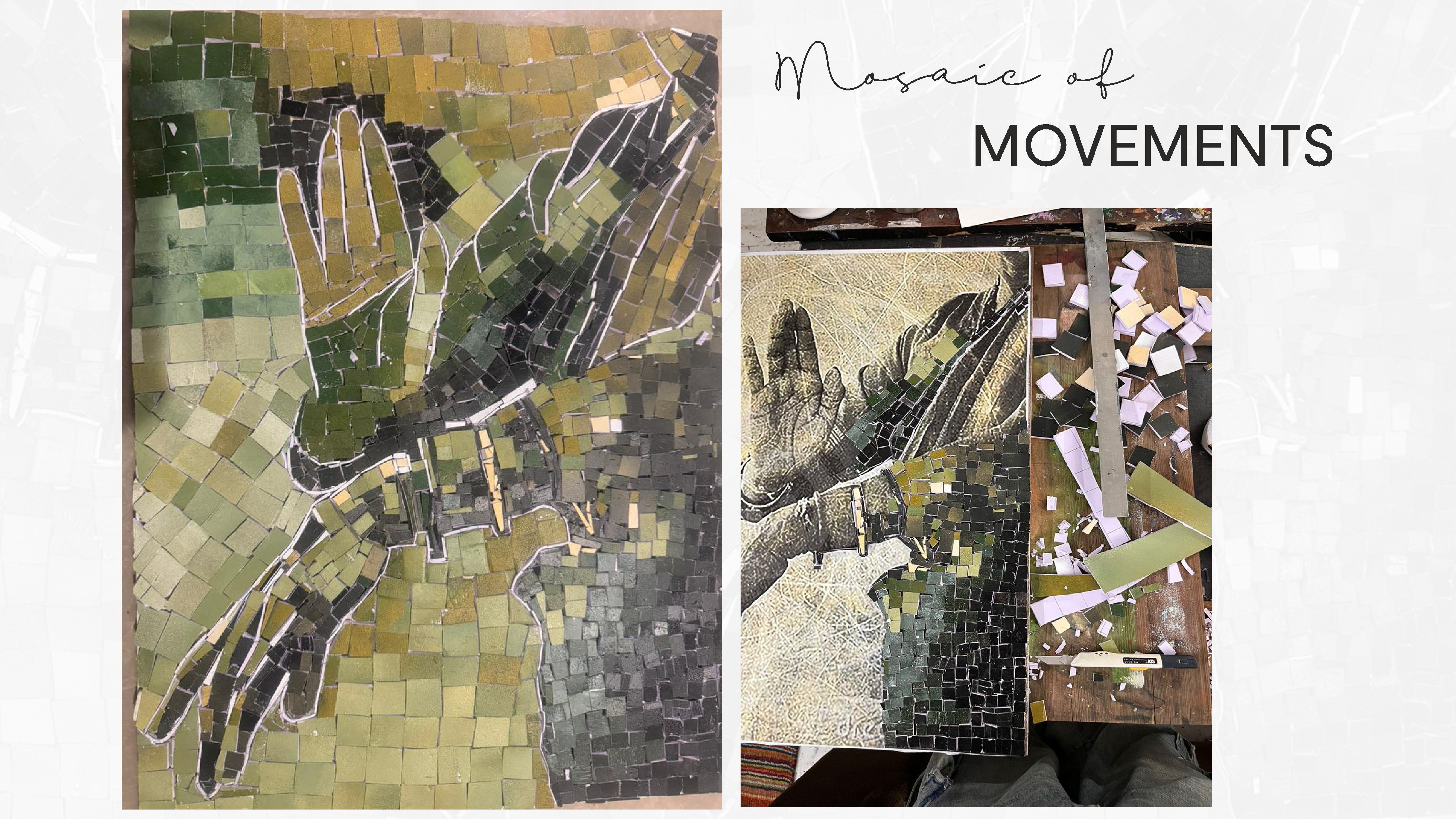
Medium: The tiles were handmade, painted with acrylics over 5mm sunboard, and then cut into suitable pieces to be arranged over a 24-inch plywood base, which I salvaged from a nearby construction site.
India is home to nine classical dance forms, and I have had the privilege of training in Kathak, the classical dance of Uttar Pradesh, for four years. Fast-paced footwork, combined with hand gestures called mudras, conveys emotions and stories central to the dance's narrative.In this project, I chose a mosaic to depict one of the many mudras used in Kathak. Each small tile in the mosaic represents the collective importance of individual movements in dance, much like how each of my artistic pursuits contributes to my love for fashion and performance. The mosaic is not just a visual representation of dance but also a reflection of how my hobbies of dramatics and dance have shaped my personal style and creativity.
Hilltop Haveli
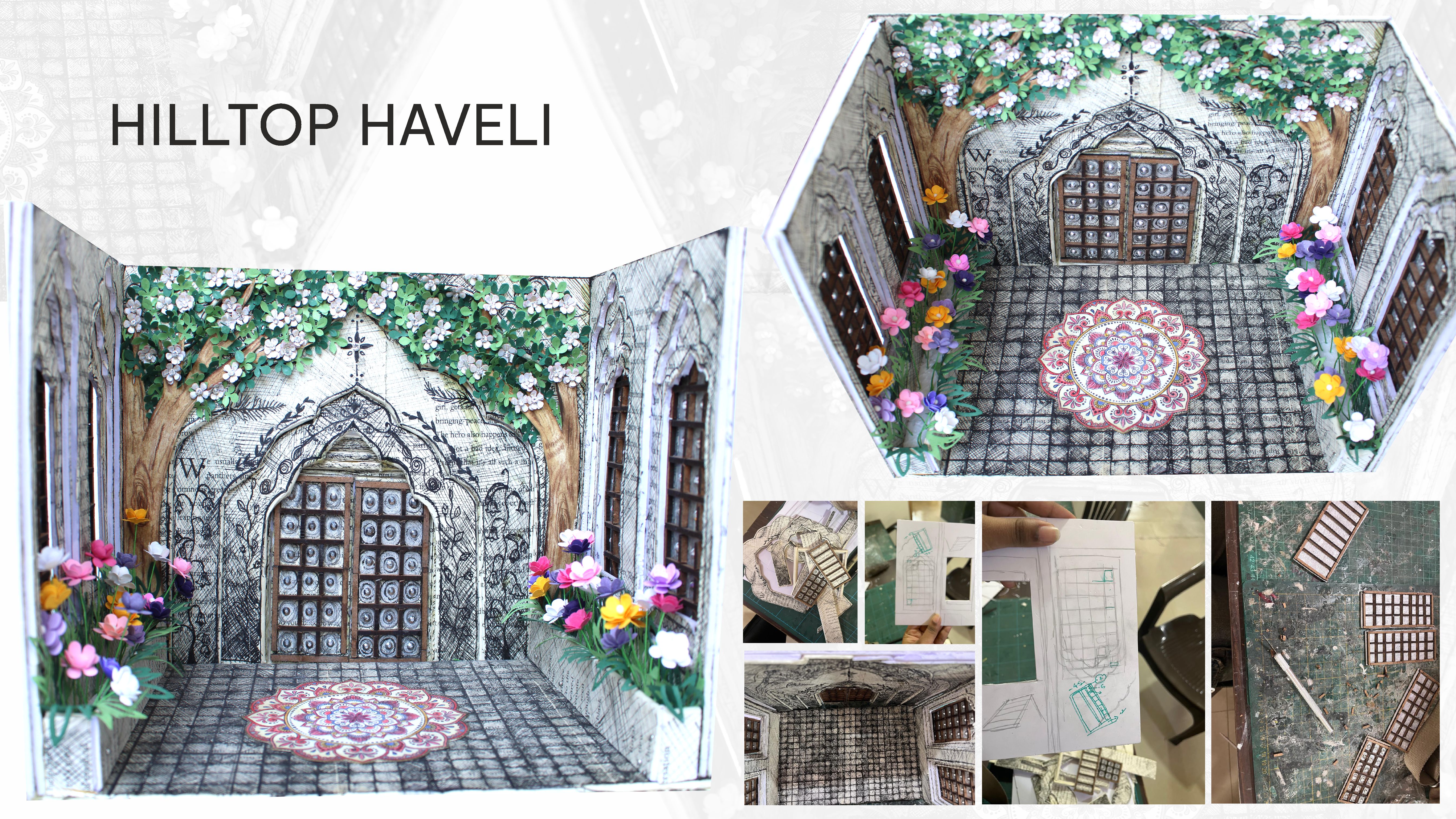
Medium: Sunboard, 120 gsm coloured paper, mdf, book paper, colour pencils
Hilltop Haveli is a model that merges British colonial and traditional Indian architectural elements, inspired by the visual similarities between my school's chapel and the Mughal arches seen in monuments like the Taj Mahal and traditional Indian havelis-large, courtyard-centered homes of the wealthy. The model integrates traditional Indian doorways and windows with British floral galleries and the iconic vine-covered exteriors of colonial-era residences in Shimla and Mussoorie.
I constructed this model by hand using a sunboard and repurposed book pages from Ruskin Bond's Death Under the Deodars. His work, set in the lower Himalayas where I lived for six years, resonated deeply with me.I meticulously crafted the flowers from 120gsm colored paper, using a Sizzix machine to cut them, then embossing each flower and placing them by hand. The finished piece reflects the harmonious blend of two cultural architectures, much like the history of the regions that have shaped my experiences.
Collection: Rajput Reflections
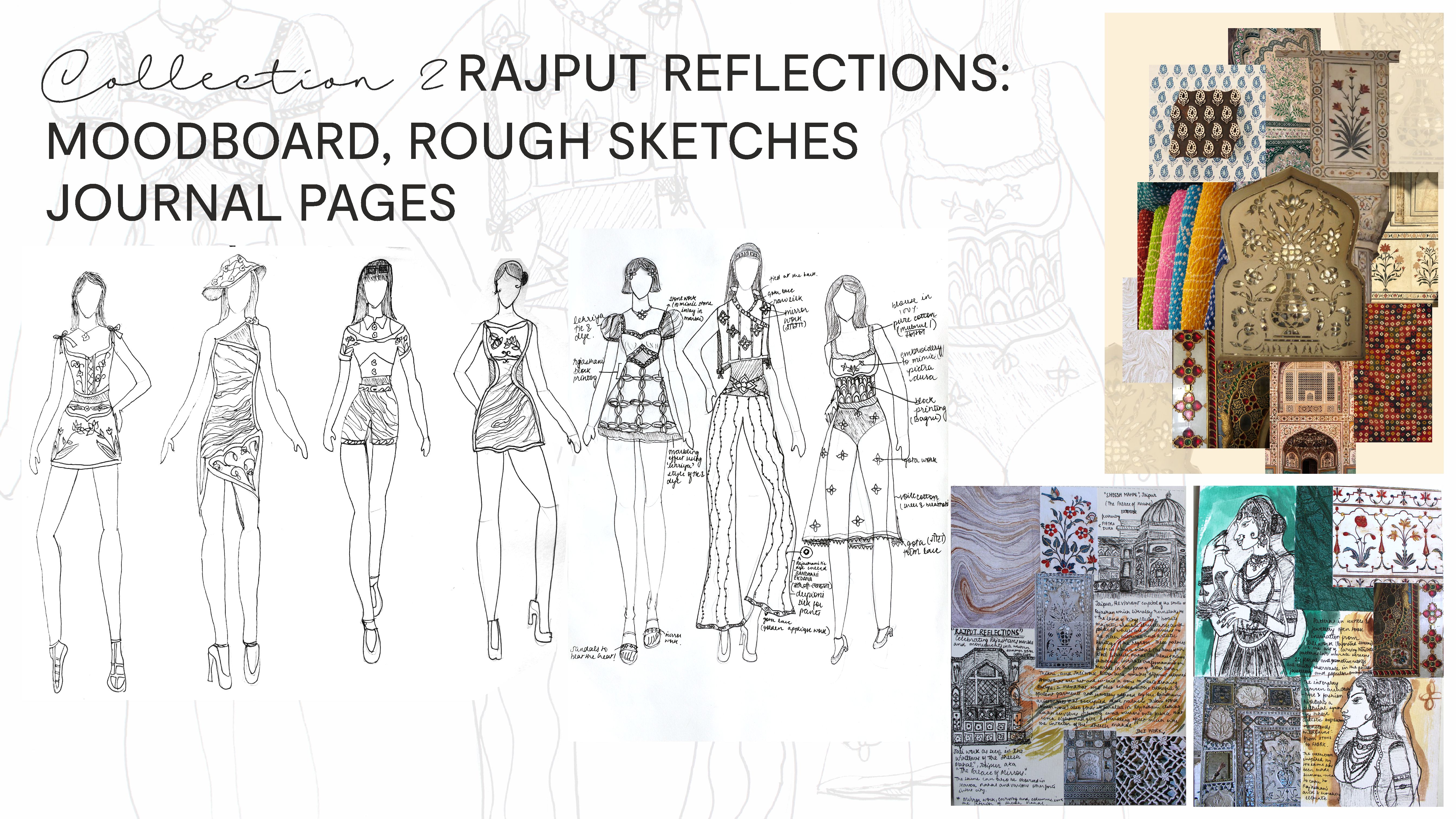
Medium: The journal is made with 360 gsm paper and involved scrapbooking, while the sketches were done on an A3-size cartridge sheet and outlined with a 0.5-micron pen.
The artistic prowess of Rajasthani architecture, embroidery, and native dyeing techniques impressed me most during my school trip to Jaipur on October 24. Visiting Sheesh Mahal, also known as The Palace of Mirrors, and The City Palace, and witnessing the exquisite mirror and stone marble inlay work were highlights of my trip. A visit to the famous Bapu Bazaar, where Rajasthani textiles reflect these architectural elements through bright colors and shisha embroidery, inspired me to design a semi-casual summer wear collection suited to the region’s hot and arid climate.
The research journal, mood board, and rough sketches for this collection are as described above.
Medium: I used A3-sized watercolor paper and colored the sketches using Staedtler watercolor pencils. The sketches were outlined with a 0.2-micron pen.
This collection incorporates silhouettes from Western summer wear, blending them with traditional Rajasthani tie-and-dye techniques such as ekdana bandhani and lehriya, along with block printing.
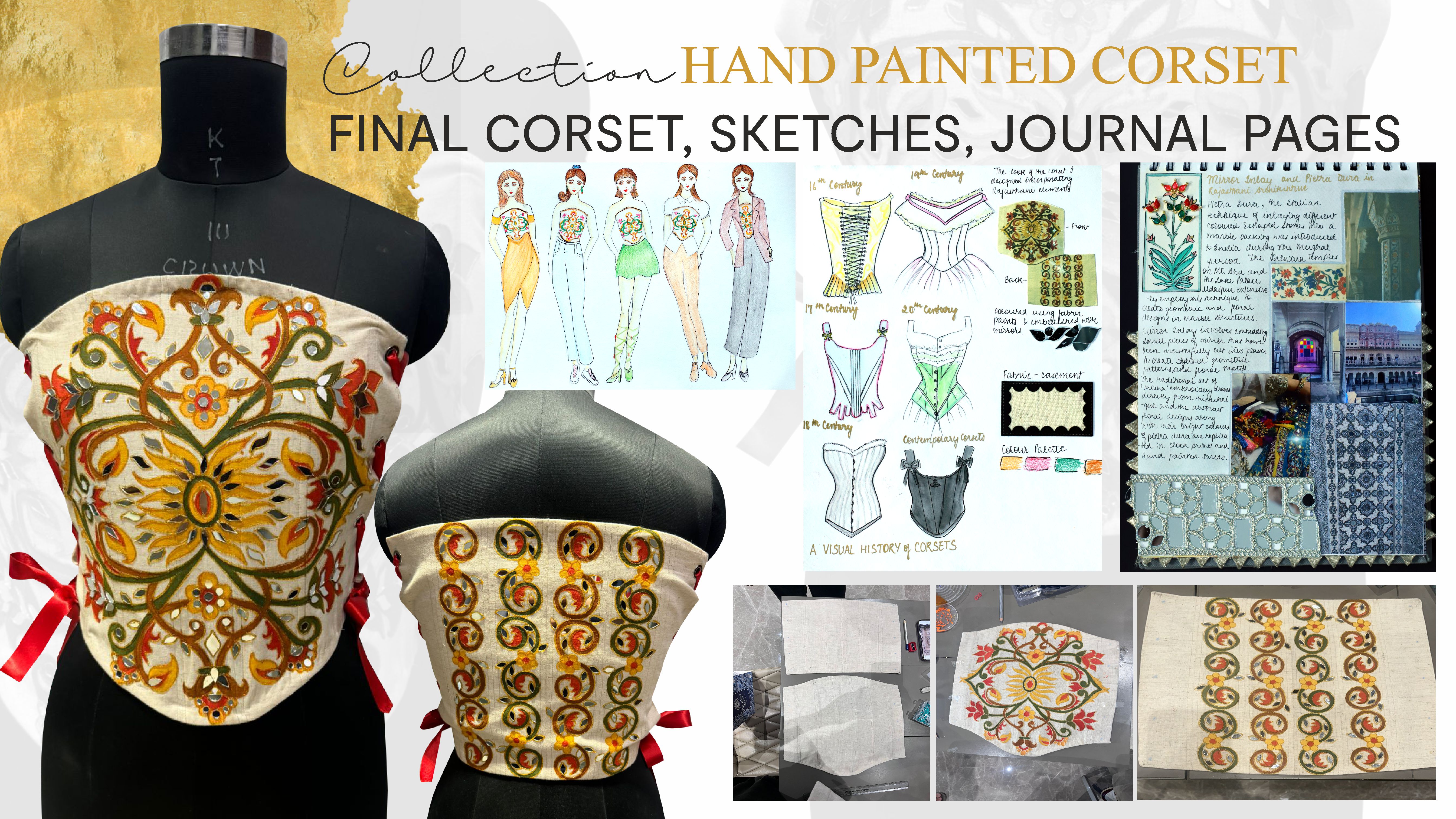
Garment: Hand Painted Corset
Medium: I painted over cloth using fabric colors and placed the mirrors using fabric glue.
The corset is a garment with centuries of history, evolving from an undergarment to casual wear. To complement my “Rajput Reflections” collection, I created a corset from spare casement fabric, using fabric paint and mirror work to emulate the colorful pietra dura and mirror detailing seen in Rajasthani architecture. The patterns on this corset take direct inspiration from the marble work of Rajasthan as does the colour scheme. I secured the front and back of the corset with red ribbon to complement the colour scheme.
The research pages and the suggested styling are as above.
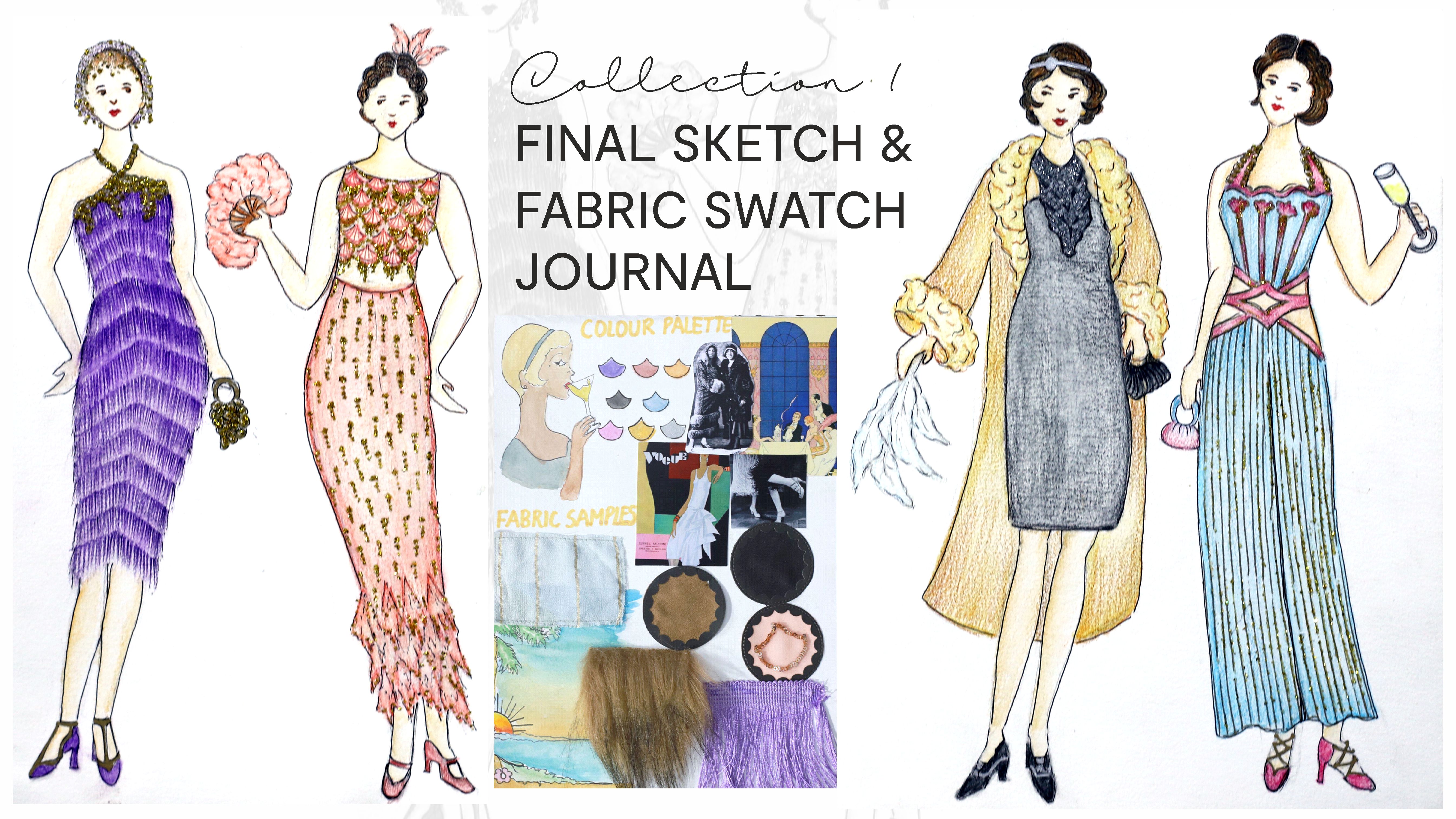
Collection: The Great Gatsby
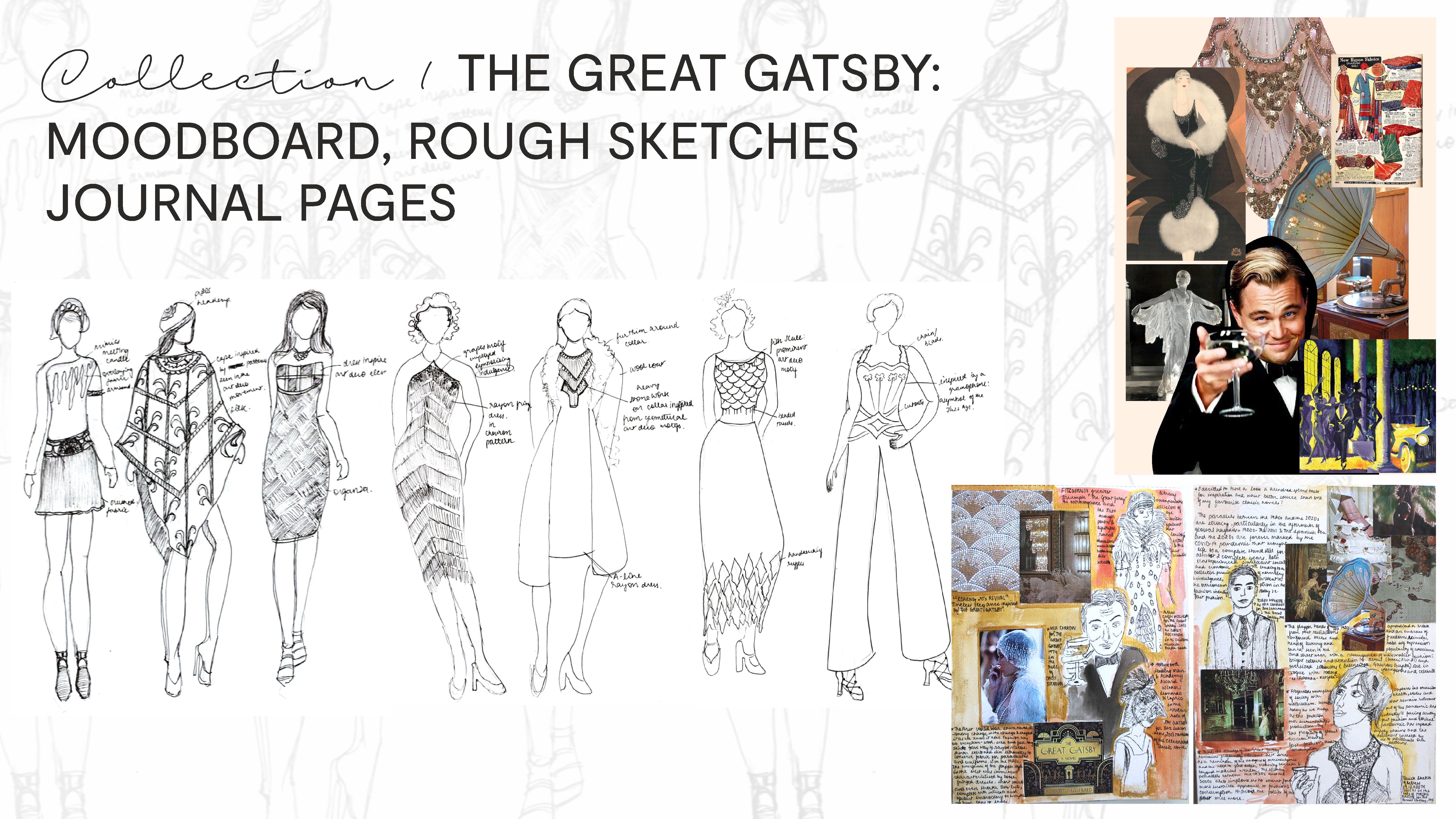
Medium: The journal is 360 gsm and involved scrapbooking and the sketches were done on an A3 size Cartridge sheet and outlined with a 0.5 micron.
As an avid reader, Fitzgerald's The Great Gatsby has been a favourite of mine ever since class 8. However, reading it after the pandemic offered me a fresh perspective. As I read the text, I was compelled by the parallels between the 2020s and the 1920s. A hundred years apart but united by tragedy: of the world war and the pandemic respectively. It is worth noting that as we emerge from the tragedy of Covid 19, humanity has inevitably turned towards the collective pursuit of indulgence and overconsumption once more; the issue that is the central conflict and message of “The Great Gatsby”. The extravagance of the 1920s has taken a new form in fast fashion; an issue that plagues the fashion industry today. I was inspired to design a high-fashion collection resistant to replication by fast fashion. The collection takes elements from the text's description of Gatsby’s extravagant parties, blending literary inspiration and imagery with sustainable and timeless fashion.
This slide showcases a digital mood board, research pages and rough sketches for the same.
Medium: I used an A3 sized watercolour paper and coloured the sketches using Staedtler watercolour pencils. The sketches were outlined using a 0.2 micron pen.
The final sketches, fabric swatches and colour palette for the collection are as above. I have utilised a colour palette of jewel tones and silhouettes and motifs from the art deco movement to emulate the extravagance described in the text.
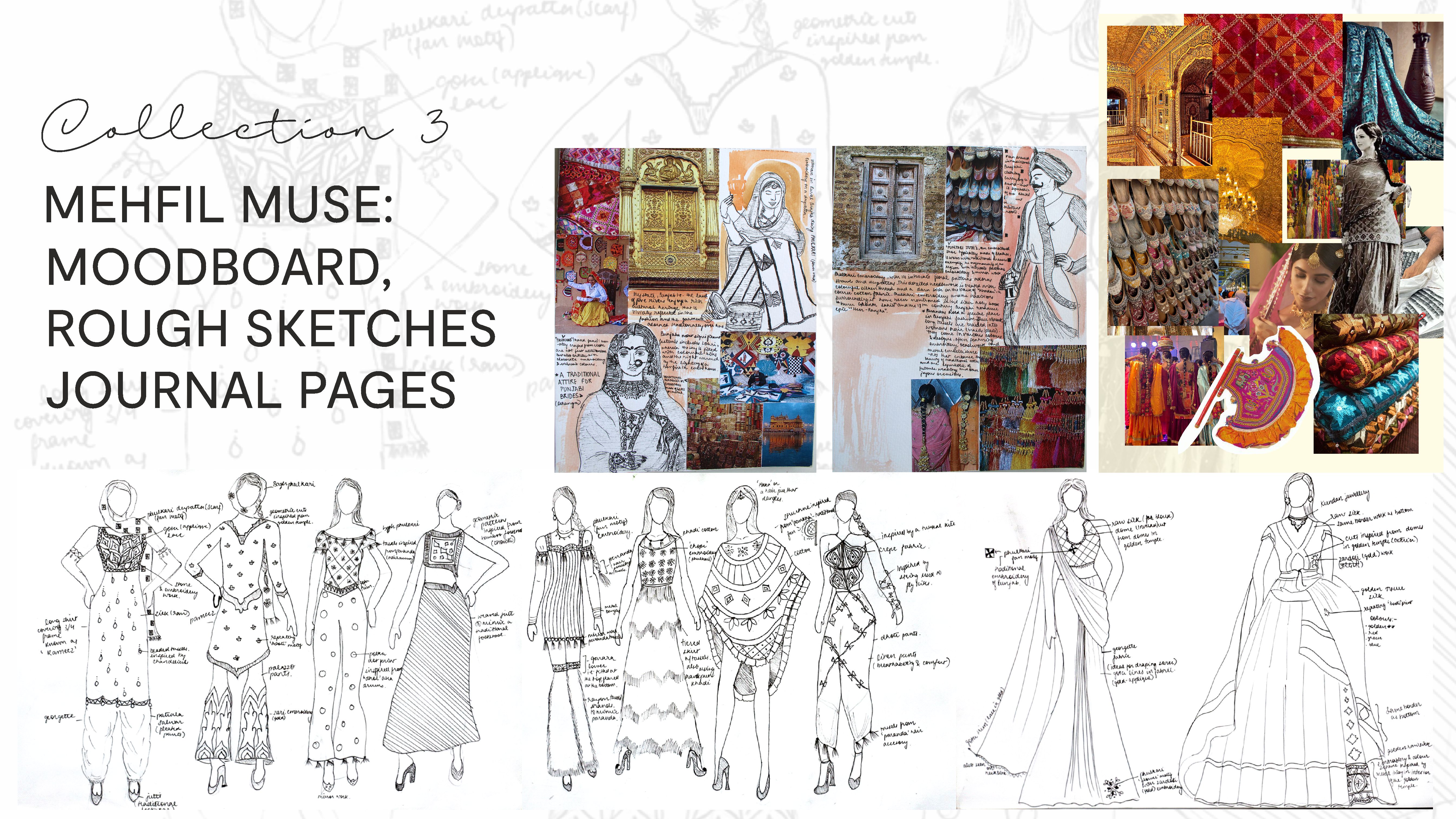
Collection: Mehfil Muse
Medium: The journal is 360 gsm and involved scrapbooking and the sketches were done on an A3 size Cartridge sheet and outlined with a 0.5 micron.
My home state of Punjab reflects its cultural vibrancy in its traditional clothing, accessories, and crafts. Phulkari, the intricate embroidery native to the region, serves as the centrepiece of this collection. It is a labour intensive and detail oriented craft, often taken up by the women in the community. These cultural revivals are essential to preserving Punjab’s artistic legacy, particularly as the state continues to embrace modernity and industrialisation.
This collection fuses traditional Phulkari motifs with contemporary fashion trends, preserving the cultural authenticity while modernising the silhouettes. Accessories like jutti (traditional leather sandals) and paranda (braided silk tassels worn in hair) complement the garments.
The research journal, rough sketches and moodboard for the collection are as above.
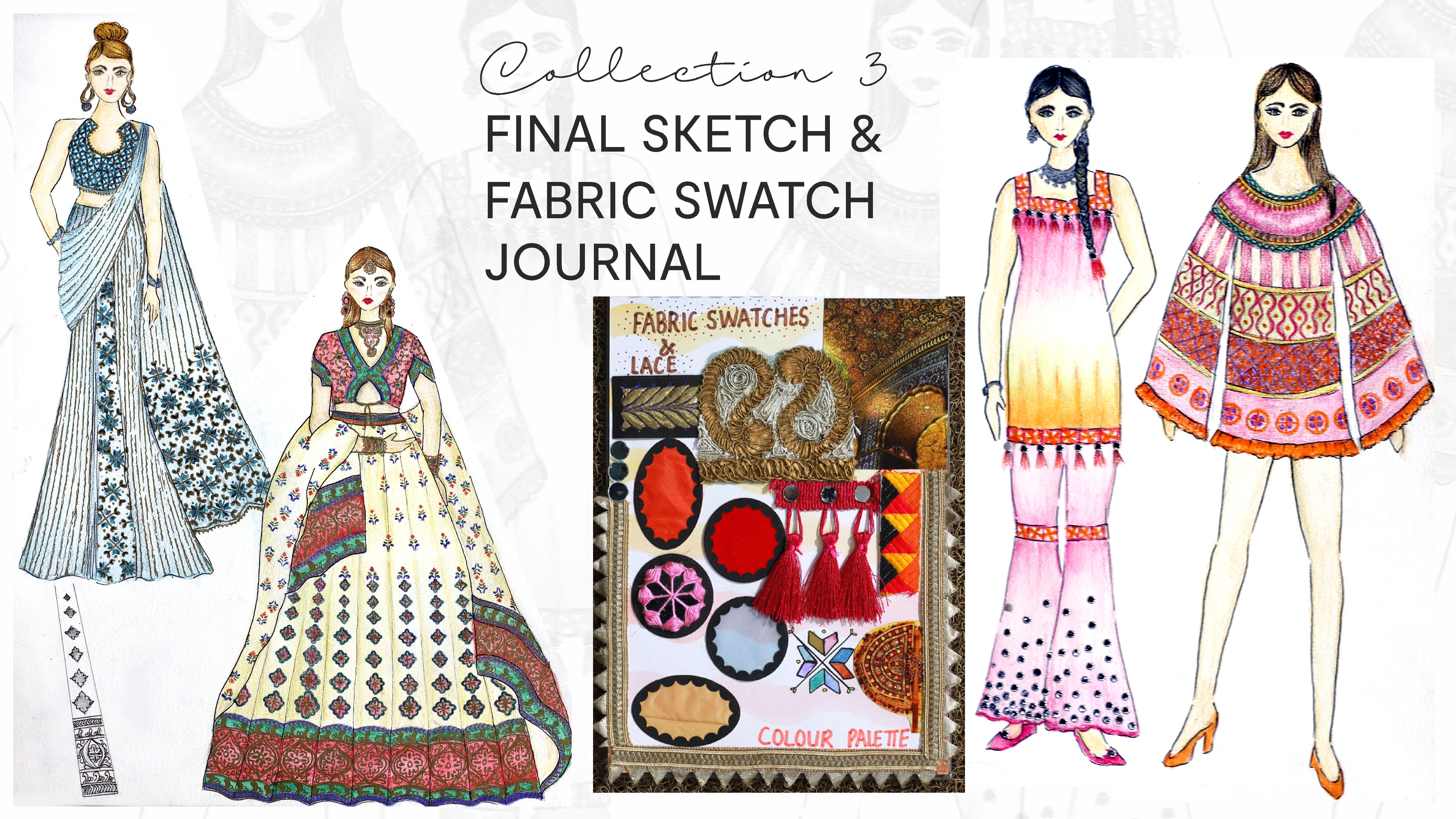
Medium: I used an A3 sized watercolour paper and coloured the sketches using staedtler watercolour pencils. The sketches were outlined using a 0.2 micron pen.
My designs seek to celebrate the revival of the aforementioned cultural elements while offering a modern, trendy interpretation. By preserving these traditions in contemporary fashion, I hope to keep Punjab's handicrafts alive in a globalised world.
This slide contains the final sketches, colour palette, fabric swatches and the different laces that complement this collection.
Collection: Retrofuturism
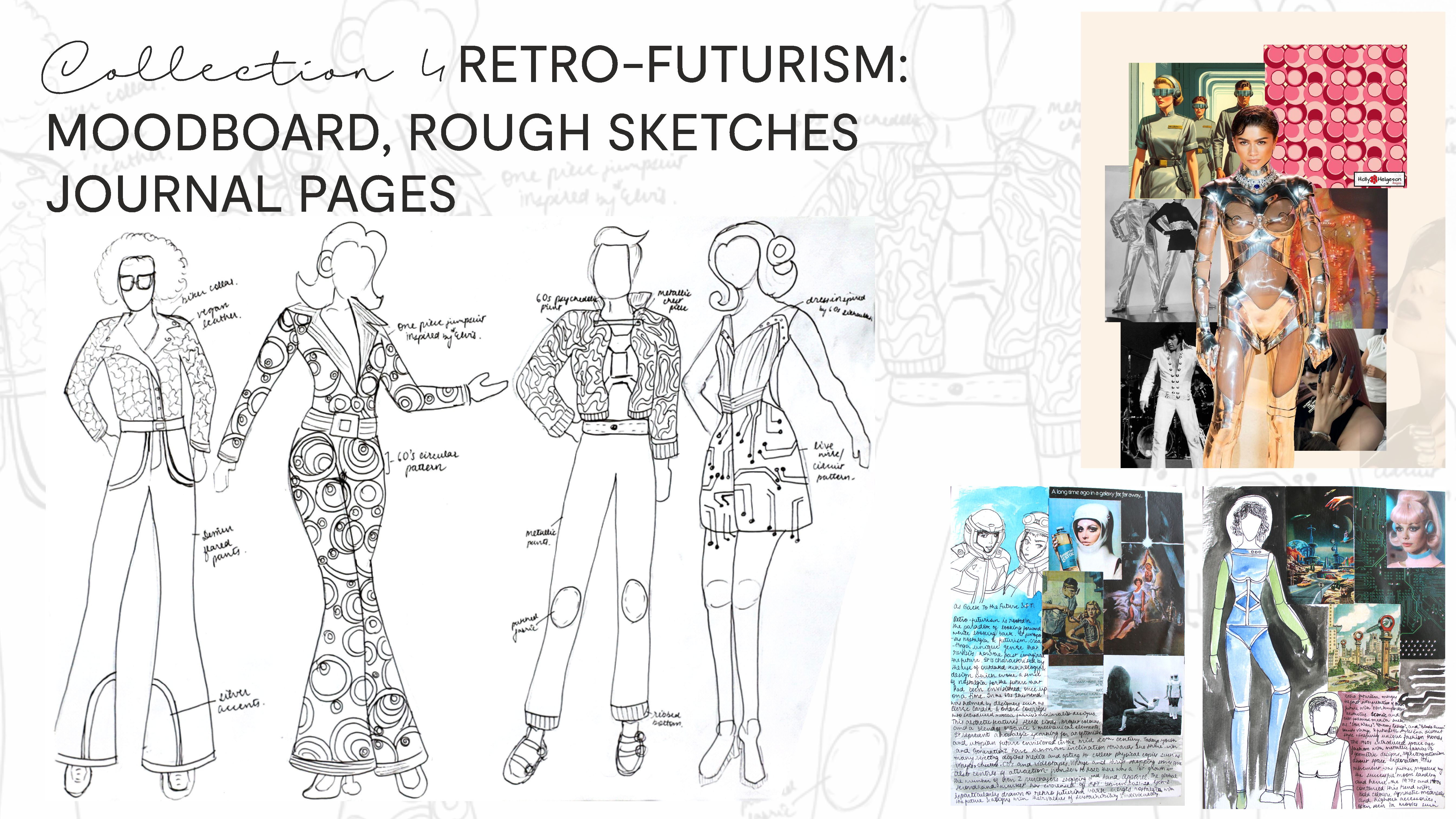
Medium: The journal is 360 gsm and involved scrapbooking and the sketches were done on an A3 size Cartridge sheet and outlined with a 0.5 micron. As an astrophysics geek, the moon landing and the space age of the 60s have always been an era of endless fascination to me. Retro-futurism is the artistic movement that contrasts the past's visions of the future with contemporary sensibilities. This juxtaposition of past dreams with modern interpretations allows for a fresh, futuristic aesthetic while honouring the creative ambition of retro-futurism. The journal pages, rough sketches and moodboard for the collection are as above.
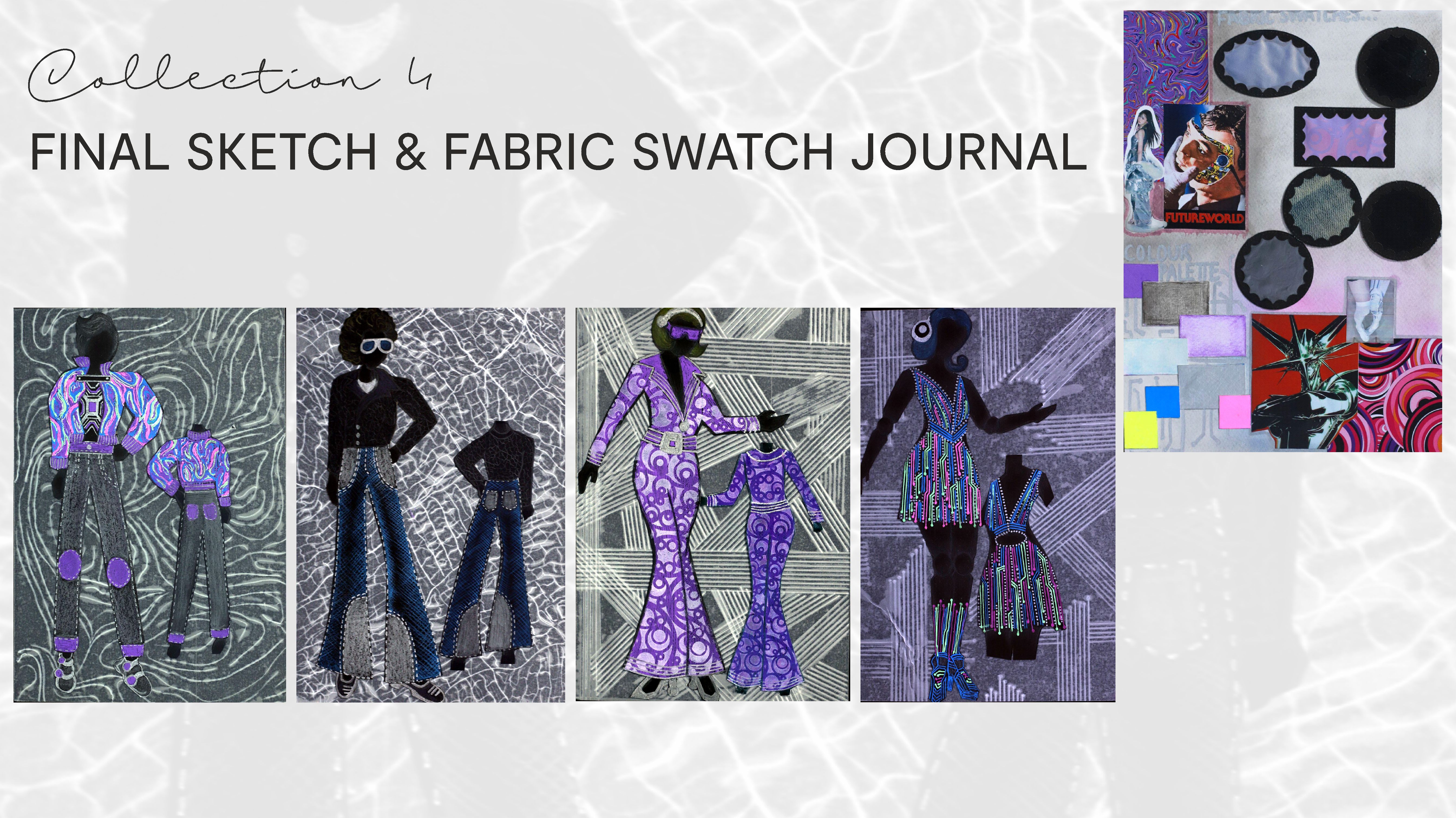
Medium: The fair sketches were done on a 360 gsm A3 sheet and coloured using neon pens, oxide inks, pencil colours and metallic pens.
Drawing on the colourful, psychedelic designs of the space age, I've created a collection that bridges the past and future. This collection combines modern interpretations of garments such as jeans and jackets and juxtaposes them with motifs and silhouettes from the mid 20th century to create a fashion spread that feels fresh and futuristic yet packed with elements from the past. I created this collection to be unisex and opted for a different layout for these illustrations, showing both the front and back of the designs and spread out over four A4 sized sheet.
Patch to Purpose
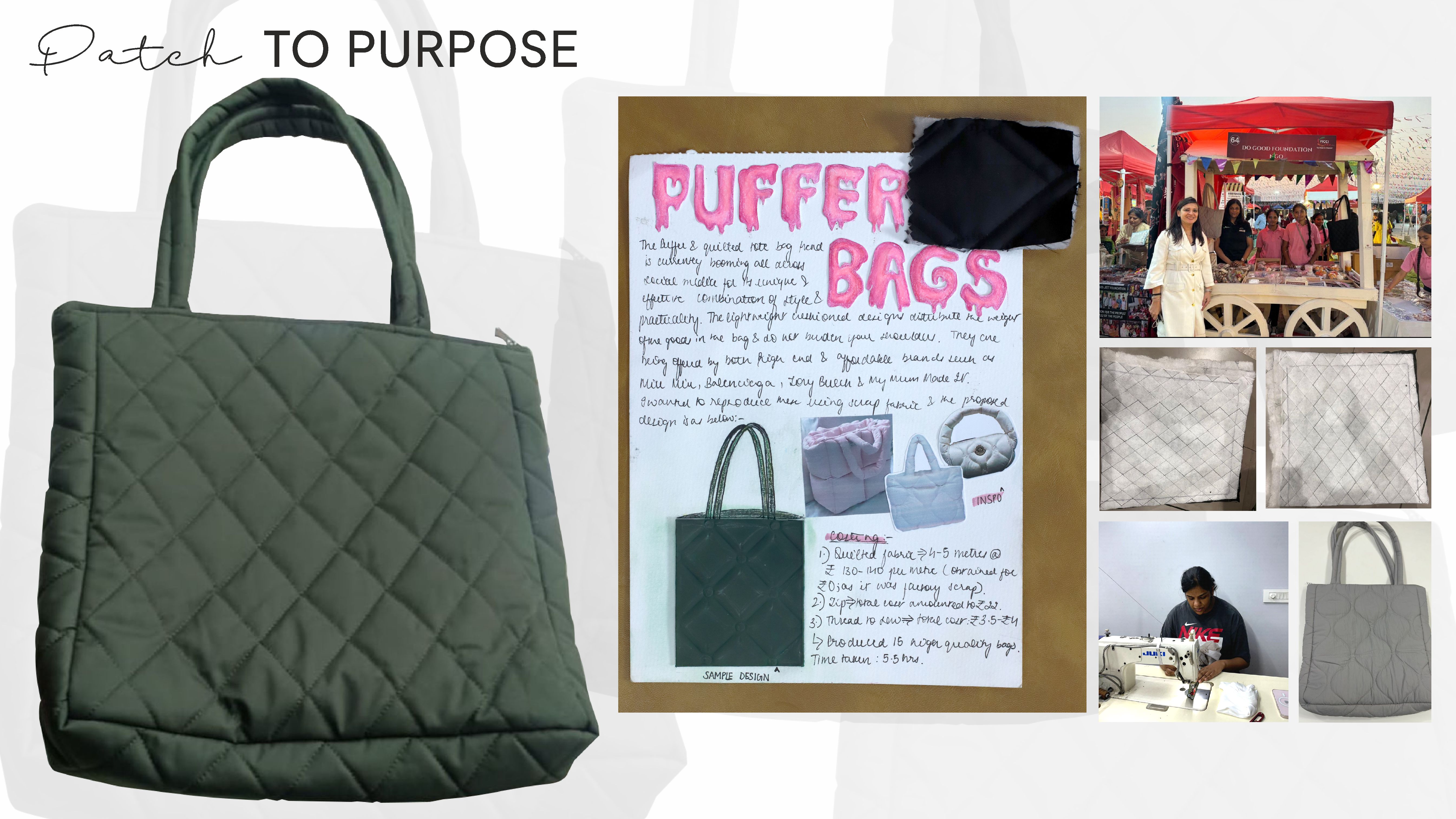
Medium: Stitching India generates about 7,793 kilotons of textile waste per year, which is about 8.5% of the world’s total textile waste. This reality was impressed upon me when I interned at a boutique this year. I took the initiative of taking the scrap fabric from different garment manufacturing concerns in my city. My city Ludhiana is famous for its hosiery production.
I converted the scrap into quilted bags that were donated to the “Do Good Foundation” that works for the welfare and development of rural migrant girls.Creating the bags was challenging at first as I had never worked with filled/quilted fabric at first but soon I got the hang of it and even taught the girls at the NGOs stay to create these bags themselves for carrying to school etcI oversaw the sale of these bags at the Rangla-Punjab exhibit in my city and my heart was filled with joy seeing the girls at the NGO take an active role in making my initiative a success.
Kantha Embroidery
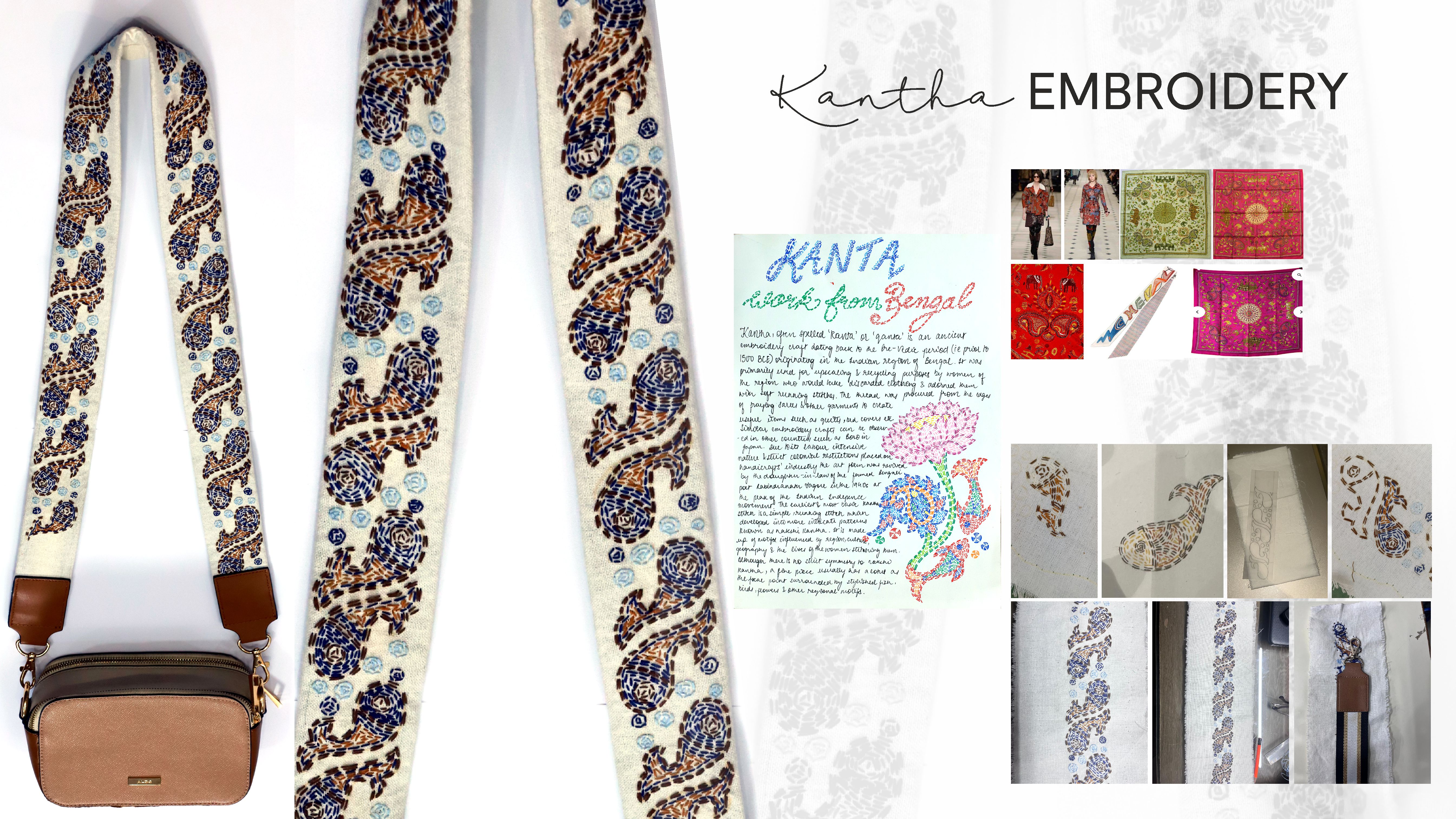
Medium: Thread and needle as the product is hand embroidered.
Kantha is the age old traditional embroidery of West Bengal which involves creating patterns and designs using different forms of running stitch. It was historically used to create new items from old and scrap fabric. With time it has evolved into an art form/ embellishment embroidery which has even been used by luxury labels such as Hermes in its Carre Kantha scarves and Burberry in its 2016 collection patchwork, prints and patterns.
Using this native cultural embroidery, I have created a bag belt on some spare embroidery cloth using a common fish motif as a modern reinterpretation of kantha and to highlight its use and revival in the contemporary fashion industry. Kantha is a labour intensive process and requires meticulous detail in each aspect. Since, I was doing it by myself it took me nearly three months to complete the stretch of fabric required for this belt and I truly gained a newfound respect for the handicraft artisans of India.
Collection: Capulet Couture
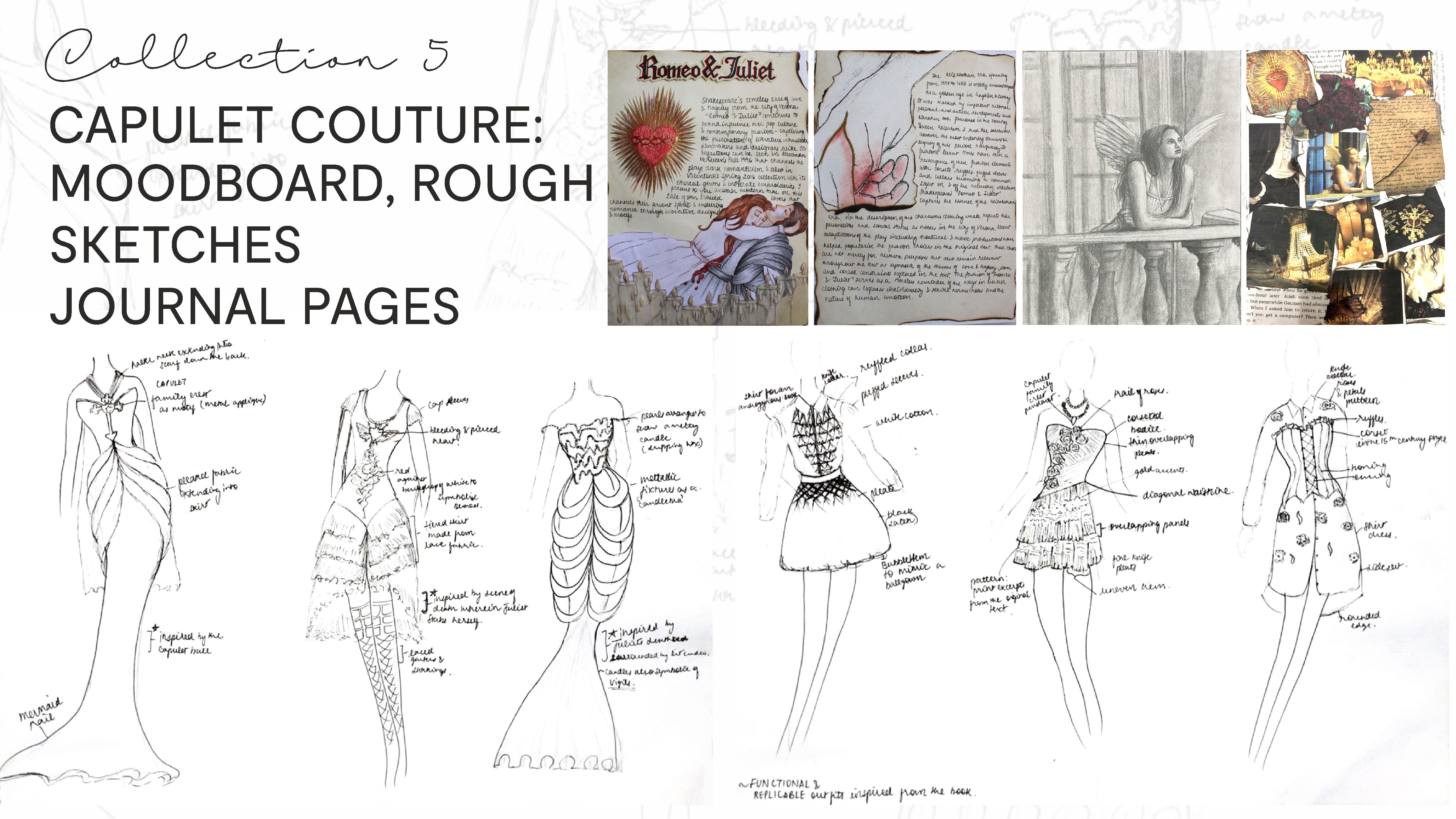
Medium: The journal is 360 gsm and involved scrapbooking and the sketches were done on an A3 size Cartridge sheet and outlined with a 0.5 micron. The sketch of Juliet is done using graphite pencil on cartridge paper (A4).
Watching the play Romeo and Juliet at my local theatre moved me to tears and made me gain a newfound appreciation for the text, which I then revisited repeatedly. Inspired by the costumes of the stage production, I decided to design a collection that utilises the motifs of the Victorian era to create a collection that is part casual and part high fashion.
The rough sketches and research journal for this collection along with a handmade mood board and a sketchbook page are as above.

Medium: The fair sketches were done on a 360 gsm A3 sheet and coloured using watercolour and colour pencils.
I have incorporated the design elements of lace, cap and voluminous sleeves along with ruffles and corset looks in a colour palette consisting mostly of red, black and white to emphasise the harm and waste that synthetic dyes cause and generate for the environment. The first three looks are more laid back and low in cost to reproduce, whereas the last three lean more towards haute couture.
The final sketches and fabric swatches for the same are as above.
Jewelry Design
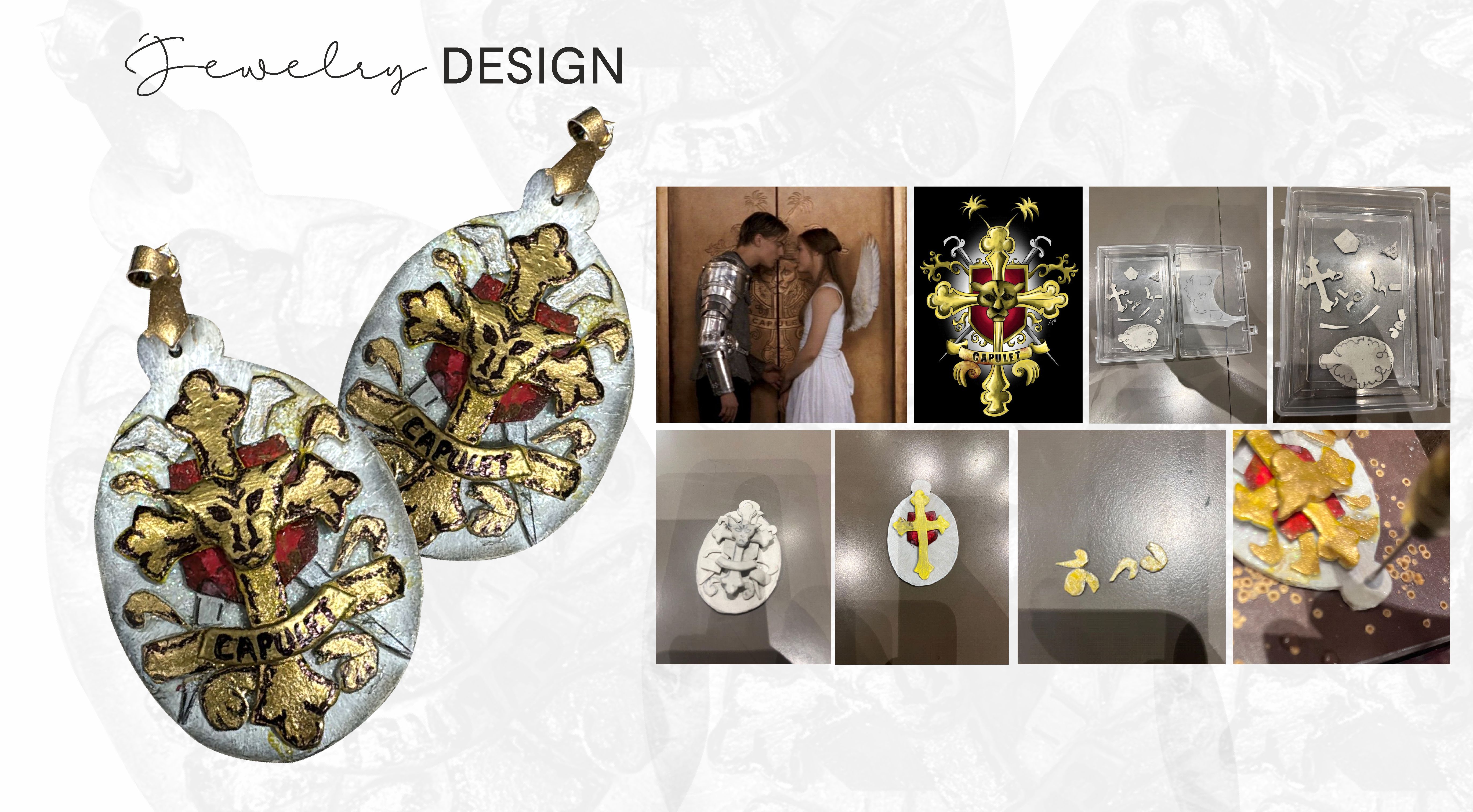
Medium - I simplified and traced the crest design, then shaped it using Fevicryl mould-it powder, cutting out and assembling each component once semi-dry. After painting with acrylics, l achieved a metallic finish by mixing golden mica powder with varnish.
Inspired by the Capulet family crest, I created a jewellery piece to complement the collection. Stippling the design with permanent marker added intricate details, resulting in a bold, historical accessory fitting for the Capulet Couture collection. I have also employed this motif in one of the haute couture designs for this collection.
Branding and Advertisement Strategy
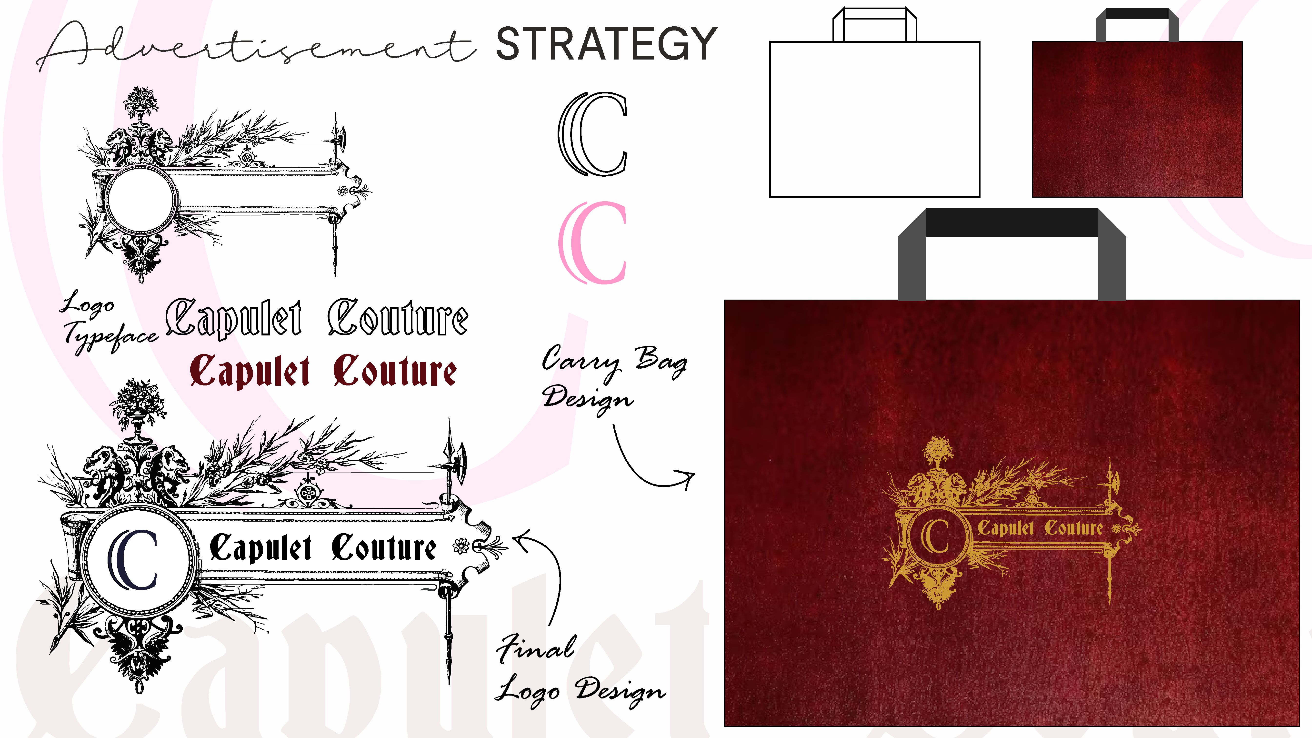
Medium: Digital Media
All successful fashion houses and labels have cultivated distinct identities for themselves in the market by means of logos that can be recognised at one glance and various other marketing and promotion strategies. Following their example, I have created this digital branding and advertisement strategy for my collection Capulet Couture by Designing various logos and carry bags for the same that will help in the promotion and creation of the brand.
The logo incorporates two "c’s," which stand for Capulet Couture, attached together. I utilised golden motifs against a contrasting red background to highlight the name and the logo, keeping in line with the colour palette of my collection.
Fabric Research
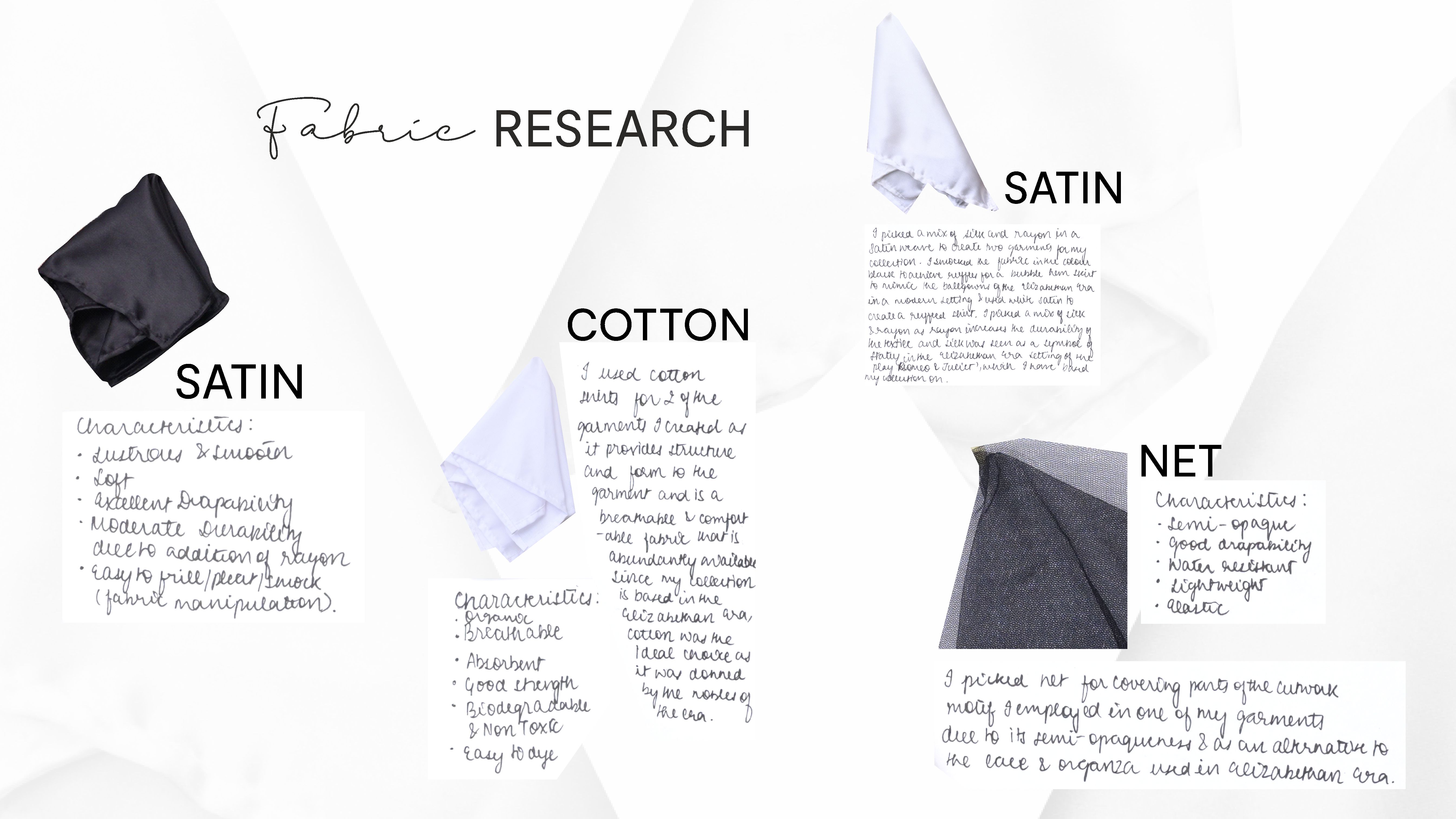
I wanted to realise some of the garments I had conceptualised in the previous collection. So, I tested and conducted fabric research to understand the various properties of natural and synthetic fabrics and measure their suitability to create the garment I wished to produce. The fabrics used by me were as follows: satin (black and white), cotton (white and red), net (black). Their various characteristics have been highlighted as above along with swatches of the fabrics. I have created 4 garments for the collection Capulet Couture which are showcased in the following slides
Collection: Capulet Couture
Garment: Upcycled Shirt Dress
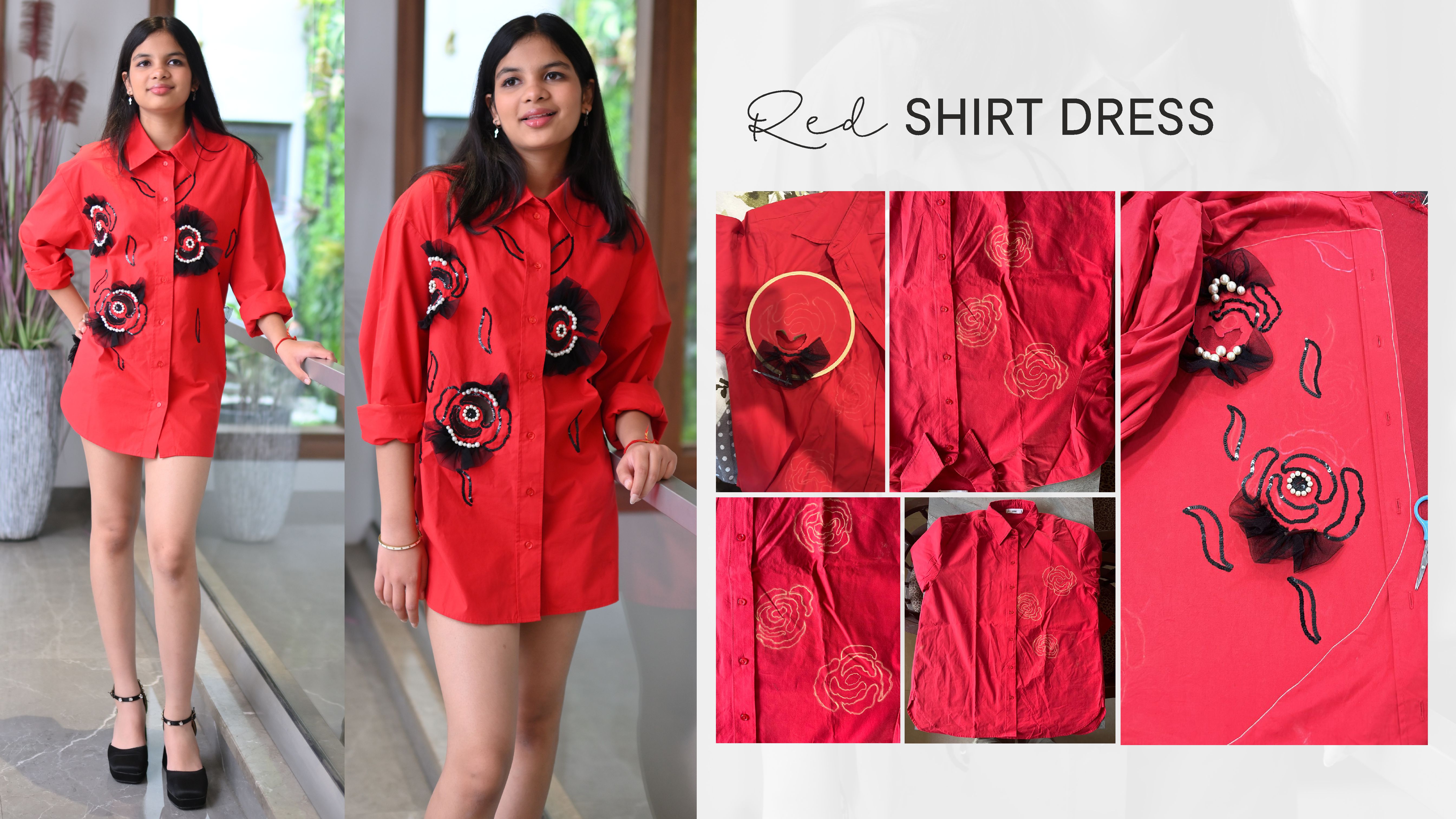
Medium: Needle, thread, sequins, pearls.
For this garment, I upcycled my fathers oversized red shirt to create a red shirt dress. I created the roses by using ruffled net along with hand sewn sequins, beads and cutwork. The cutwork by itself proved impractical for wear and made the garment rather fragile hence, I attached pieces of net underneath for more coverage and structure. This gave the old garment a new and fresh look and I believe we can all do our bit in upcycling and recycling old clothes to reduce waste generation.
Garment: Ruffled Shirt
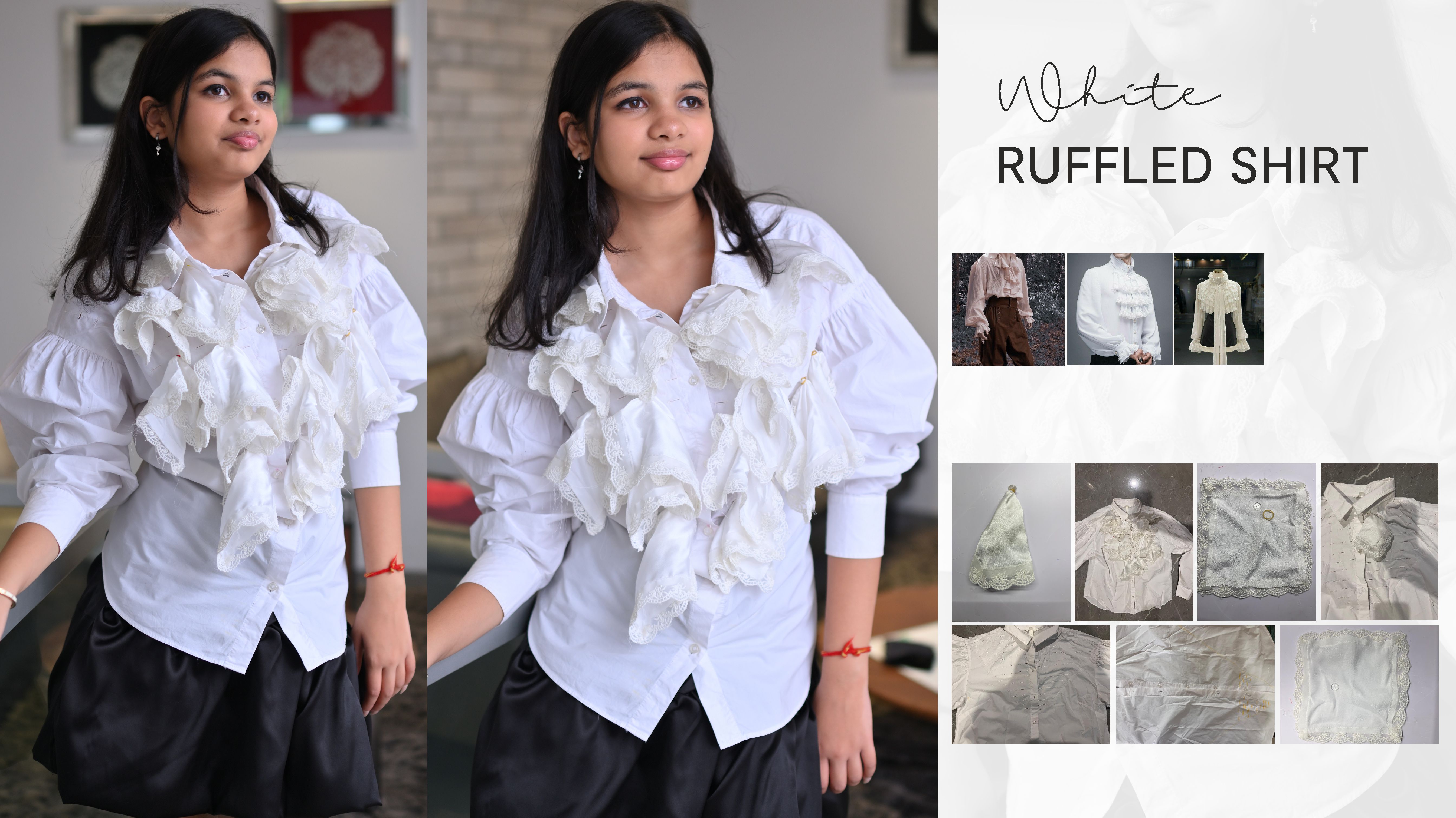
To create a renaissance era inspired blouse, I upcycled my old white shirt and tried different methods of stitching and attaching pieces of different fabrics to the shirt. Eventually i created buttonholes in the front of the shirt and by securing a button in small satin handkerchiefs (created by adding a lace border to all four corners of a piece of 4x4 white satin), i placed these ruffled pieces the wrong way round through the buttonholes so the fabric hangs from the front of the shirt.
Garment: Smocked Skirt
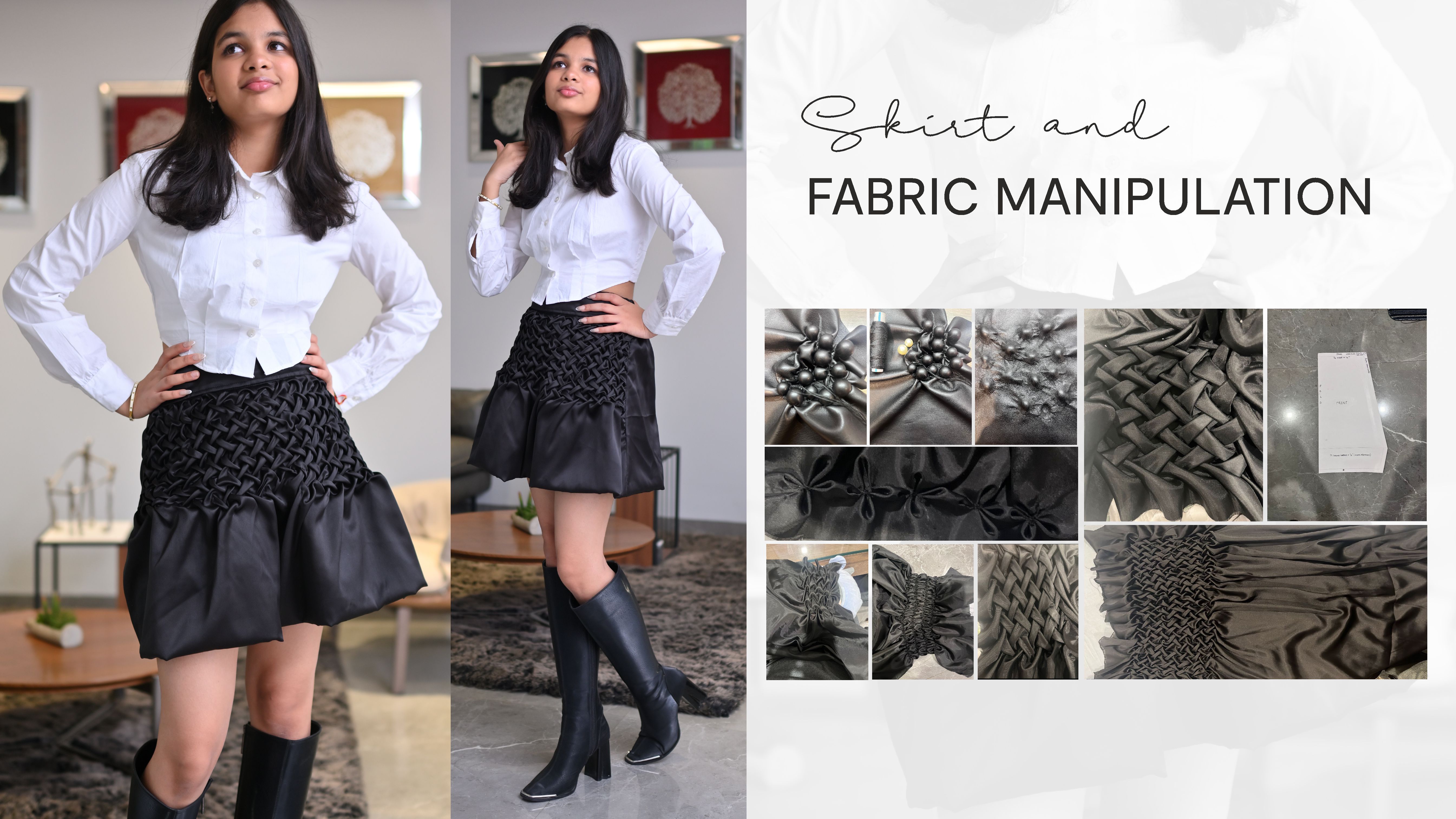
Medium: Stitching using machine; hand smocking using needle and thread
To achieve a balloon skirt which could mimic the voluminous structure of an antique ball gown in the form of a mini skirt, I experimented with different forms of fabric manipulation, eventually settling to hand-smock the fabric with a lattice smock. The bubble hem was achieved by lining the skirts bottom with ken ken. Below are different styles of fabric manipulation I experimented with and the process along with the pattern for the skirt.
Client profile : sex-Female; height-5’3 inches ; waist - 26 inches.
Since the skirt is symmetrical, the pattern for the front was reused for the back and the belt was added later on as the smocked fabric alone gave an incomplete look to the skirt.
Garment: Newspaper Dress
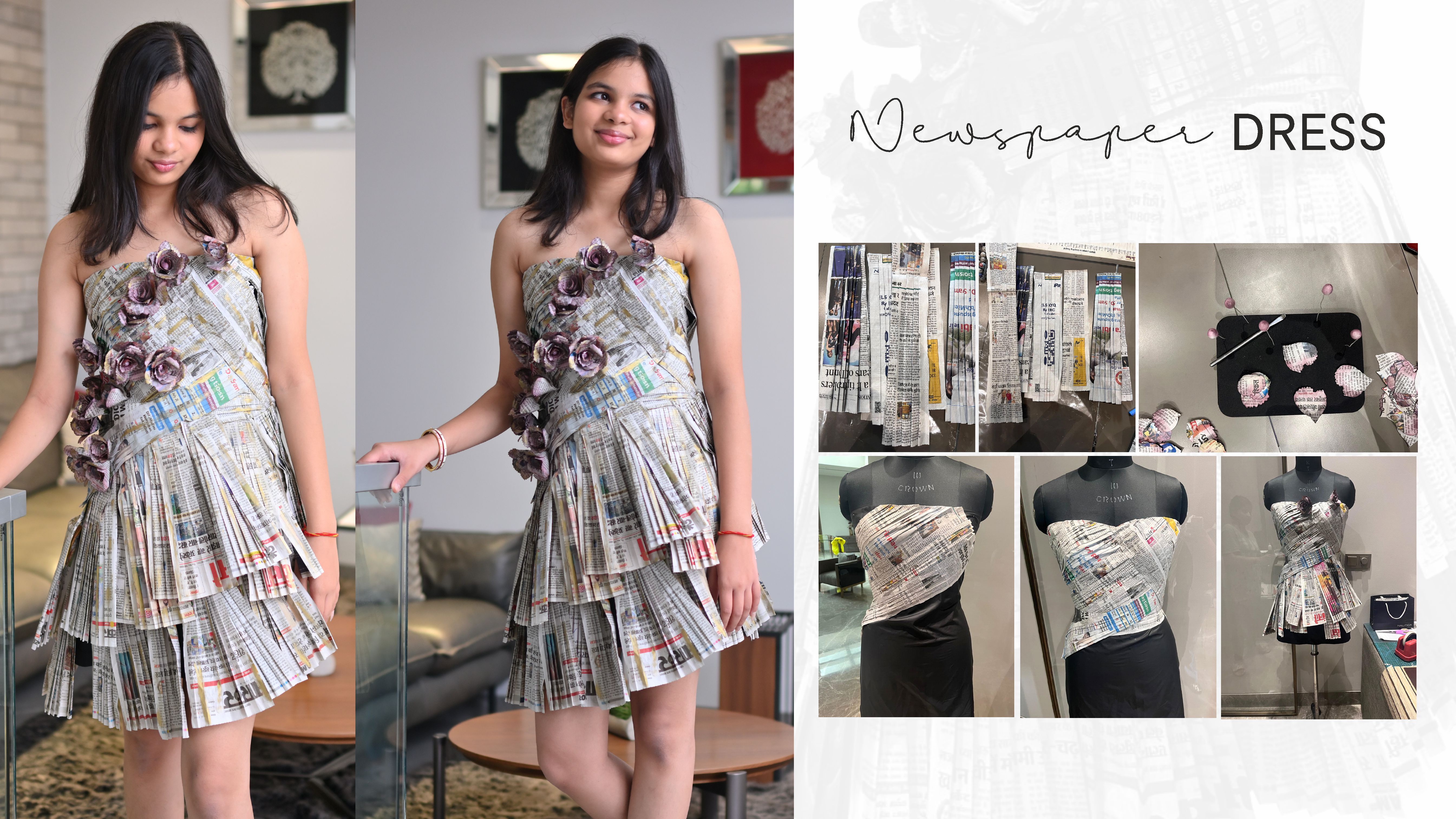
Medium: Newspaper, Glue, Tafetta
I wanted to achieve symmetrical pleats with text to realise this garment and the fabrics available at hand weren't able to support the structure. To mimic the rustic look of book text, initially experimented with book paper, but it proved too fragile. Instead, I used newspaper, knife-pleating each panel with a scoring board, and created a wearable garment by adding a taffeta lining secured with velcro. For the bodice, I crafted roses from embossed newspaper, colouring them with archival ink to enhance the visual effect of aged text.